THE POLARIZATION OF AMERICAN POLITICS
Below are Notes for a Talk on Political Polarization that I gave
at a
Number of Universities and Meetings during AY2000-01. They are part of a book that I am currently
writing with Howard Rosenthal and Nolan McCarty
The talk below is very dated but it predicts what has happened in the last 8 years. The latest
analysis is in the QuickTime movie file and PowerPoint Presentation below:
Files for Polarization Talk (14 September 2009):
 HS01_111_September_2009.mov -- House and
Senate DW-NOMINATE Animation for Congresses 1 - 111 (458meg)
HS01_111_September_2009.mov -- House and
Senate DW-NOMINATE Animation for Congresses 1 - 111 (458meg)
PowerPoint Presentation on
Polarization --
(2.6Meg)
Introduction: The Polarization of the Political Parties
in Congress
- Our old Work: 1959 - 1981 I.G. Ratings
HR and I began working on this problem in 1983 and our early non-dynamic
work on IG ratings used analysis of variance to detect a
polarizing trend.
D-NOMINATE (Chap. 4 of Congress) and DW-NOMINATE
(developed with Nolan McCarty)
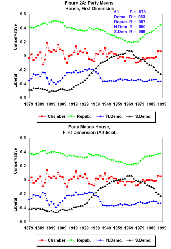
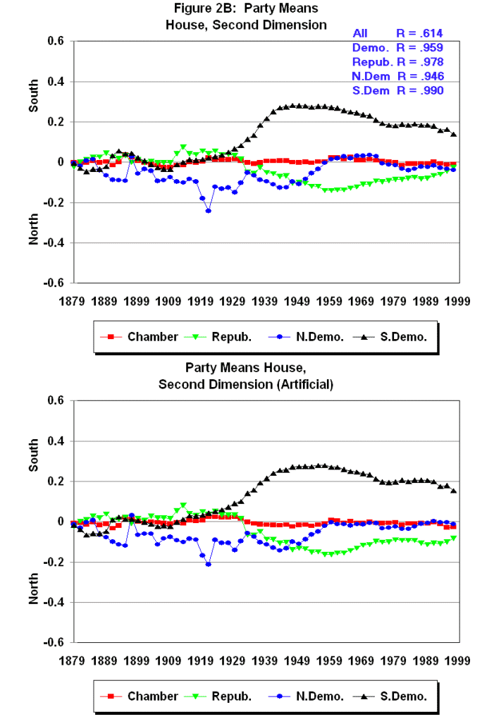
The animated gif shows the House and Senate DW-NOMINATE two-dimensional linear
scalings. The 2nd dimension is shown without the dimension
weight of .31 being applied so that the structure of the two-dimensional space
is more easily seen. The results are the same as we discuss in Congress:
A Political-Economic History of Roll Call Voting. From the end of
Reconstruction until the late 1930s congressional voting was essentially one
dimensional. Beginning in the 1930s an important 2nd dimension
appeared that picked up the division within the Democratic party over Civil
Rights for Blacks. The clear division of the Democrats into Northern and
Southern parties can be seen in the spatial separation of the "S" and "D"
tokens. After the mid-1970s this division gradually disappears and voting is
once again one dimensional. A very important feature that the animated gifs
show is that the same forces are at work on both
chambers. The two scalings are completely separate but the voting structures
in the two chambers are exactly the same.
We update these trends in our recent LSQ paper:
D-NOMINATE
After 10 Years: A Comparative Update to Congress: A Political-Economic
History of Roll Call Voting .

Document the polarization of the Congressional parties for the Post-Reconstruction
period: 1879 - 1998.
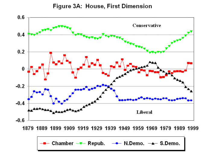
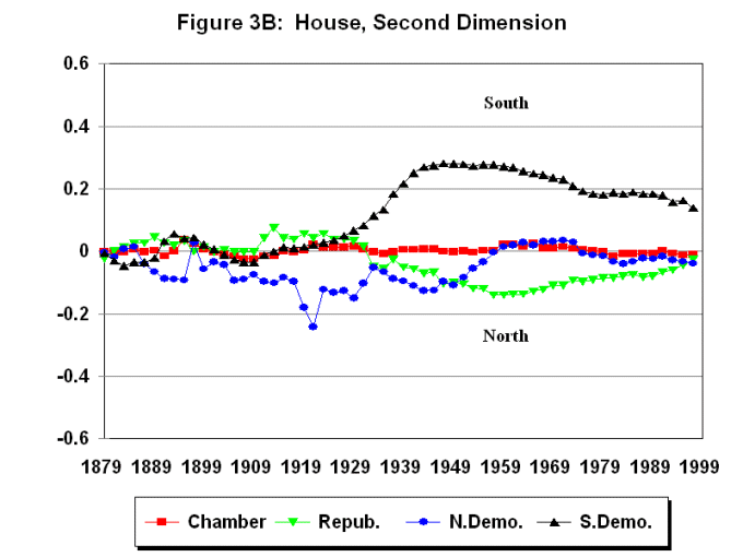
These figures follow the format in Chap. 4 of
Congress. They are calculated from the coordinates shown in the animated gifs
and the 2nd weight is applied.
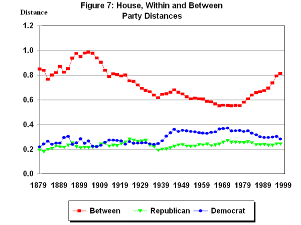
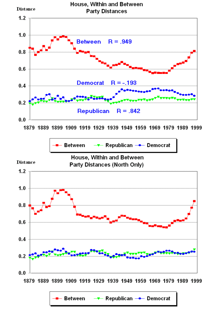
House Party Means 1st and 2nd Dimension
1879-1998.
House Polarization -- the graph shows average between and within Party
distances for the Democrats and the Republicans.
Within party measure: compute the distance
between every possible pair of D's/R's and divide by the number of
pairs.
Between party measure: compute the distance between every possible D-R
pair and divide by the number of pairs.
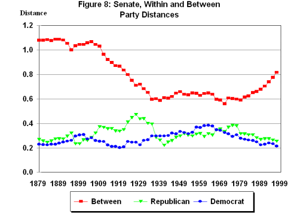
Senate -- Basically the same pattern as the House. The larger
within party distances for the Senate in the early 20th Century
are due to the Progressive bloc of Republican Senators.
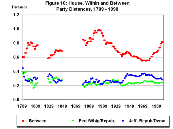
House: 200 Year Perspective on Polarization -- The current
level of polarization is about the same as during the period around the
1800 Election.
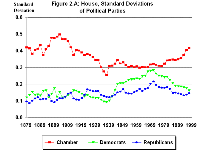
House: Another Perspective, Standard Deviations of the Chamber
and the two Political Parties -- First DW-NOMINATE dimension only.
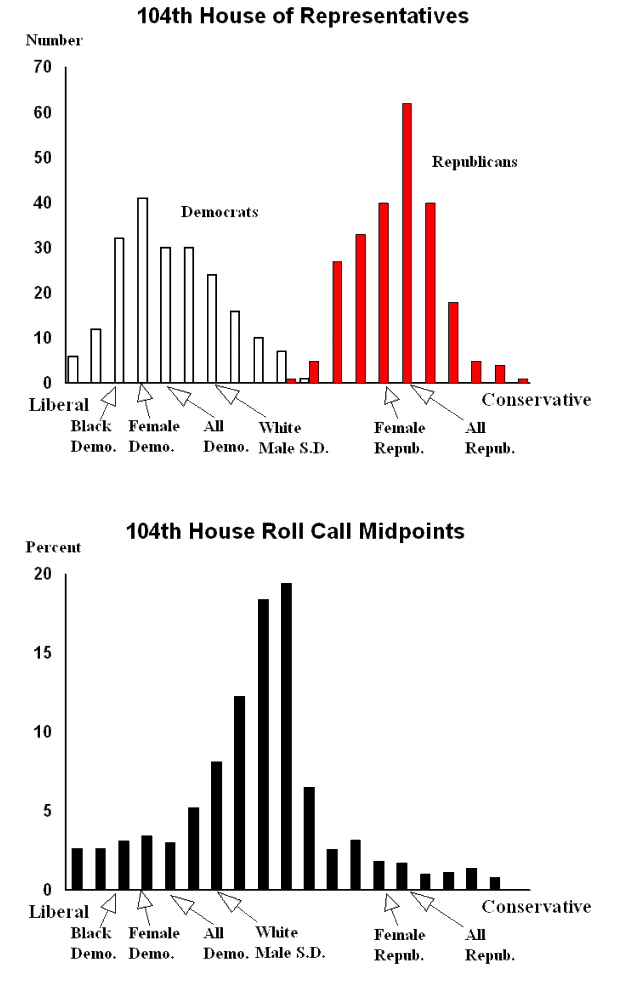
104th House -- Almost no overlap of the parties.
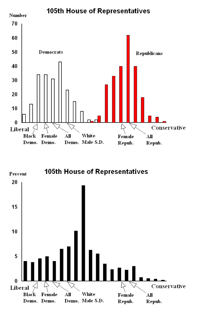
105th House -- Same as the 104th but the
distribution of cutting points is less skewed into the Democrats because the
election losses by the Republicans.
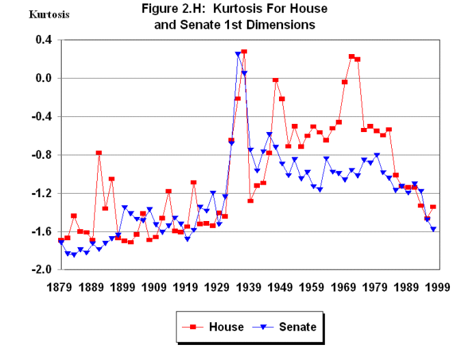
House and Senate Kurtosis of first DW-NOMINATE dimension.
(Recall that as Kurtosis goes to -2 you have perfect bimodality.)
The above graphs were from a 2-dimensional dynamic model (the basic
model we used in Congress). The graphs are essentially the same
if you use constant model coordinates (no time trend -- legislators have
fixed positions throughout their careers). Summary: Polarization is a replacement
effect. Not a conversion effect.
- What is Causing the Polarization of the
Congressional Parties?
The focus will be on the Post WWII period when enough data is available to
test various explanations.
- The Realignment of the South After 1964:
We know that this has occurred in
terms of presidential elections, party identification, elective offices, etc.
Did these changes in turn produce the increase in polarization after the late
1960s?
To test this, we ran DW-NOMINATE without the Southern States (both Southern
Democrats and Republicans thrown out of the roll call data) for the 1st
through the 105th Congresses.
Between party distances -- The Figure below shows the party distances
for all Representatives for the 46th to the 105th Houses
(note that this is the same figure shown above)
along with the same measures without the Southern States. The Pearson
correlations between the measures are shown in the upper figure.
Party Means from the "All" scaling and the "North Only"
Scaling for one and two dimensions. The Pearson correlations between the
Republicans and Northern Democrats are shown in the upper part of each figure.
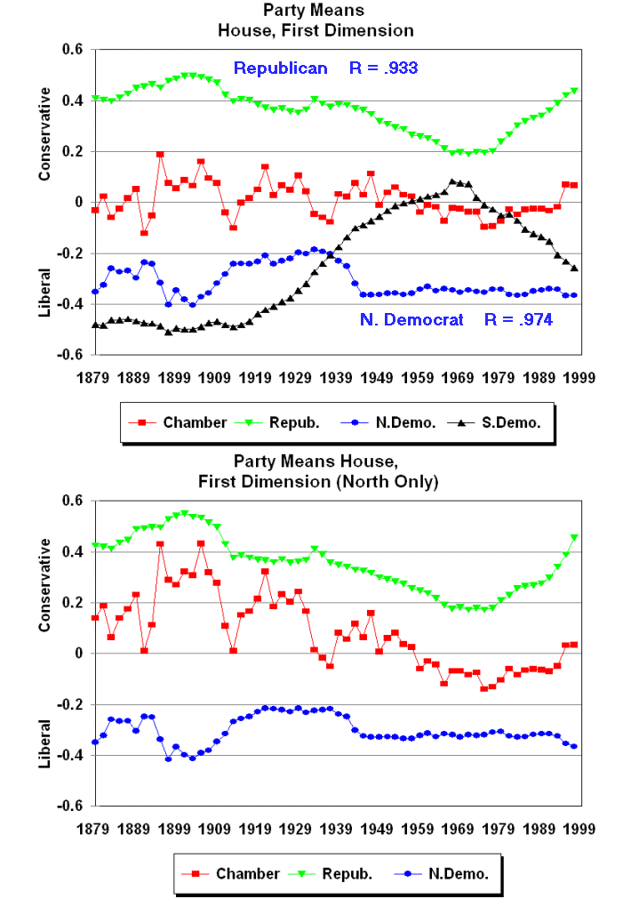
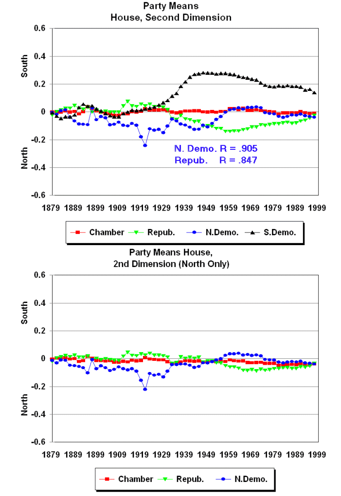
The realignment of the South in the modern period cannot account
the recent trend to polarization. The figures above show almost exactly the
same patterns of party distances and party means when the South is completely
removed from the roll call data. The patterns for the North-Only scaling of
the Senate are almost identical to those for the House. The correlation between
the North-Only scaling and the regular scaling are .982 for the between party
distances and .971 for the Republican within party distances.
- Could a Changing Distribution of Roll Call
Margins Account for the Polarization?
To test this we re-ran DW-NOMINATE for the 1st
through the 105th Congresses constraining each House to have
the same distribution of roll call margins. The average distribution of
margins for all 105 Houses was used as the common margin and the number of
roll calls for each House was set equal to 400. The distribution is shown
below:
C
C  ROLL CALL WEIGHTS
C
   1 50 - 55      92  0.23
   2 56 - 60      80  0.20
   3 61 - 65      60  0.15
   4 66 - 70      44  0.11
   5 71 - 75      32  0.08
   6 76 - 80      24  0.06
   7 81 - 85      20  0.05
   8 86 - 90      16  0.04
   9 91 - 95      20  0.05
  10 96 - 97.5    12  0.13
To construct the artificial data for each House we sampled each margin category
with replacement to get the required number. For example, if for some
House there were 75 roll calls with margins in the range 66 - 70 then 44 roll
calls from those 75 were drawn with replacement. If there were no roll calls
in the range then no roll calls could be included. Hence, there are a few
Houses with fewer than 400 roll calls. For example, the 58th House
had no roll calls with margins 71-75, 81-85, 86-90, and 91-95. It was the
most extreme case. Houses 2, 3, 4, 15, 17, 19, 22, 23, and 78 each had one
missing margin and House 18 had two missing margins. In sum, 94 of the 105
Houses had no missing margins and 103 of 105 Houses had either no missing
margins or only one missing margin.
The Figures below show the party distances and the party means
on the first and second dimensions
for all Representatives for the 46th to the 105th Houses
(note that upper graphs in each figure are the same as those shown above)
along with the same measures from the DW-NOMINATE scaling of the roll call
matrix with the fixed distribution of margins. The Pearson
correlations between the measures are shown in the upper graph.
The distribution of roll call matrgins cannot account for the
recent trend to polarization. The figures above show almost exactly the
same patterns of party distances and party means when the margins are constrained
to be the same across Houses.
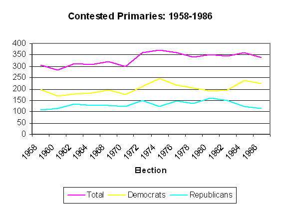
- Are Primary Elections the Cause of Polarization?
If polarization were a result of competition between "moderates" and
"ideologues" in the party primaries, then we should see more competitive
primaries during the period that Congress is polarizing.
Number of Contested Primaries for the House (more than one
candidate).
Note that there is a jump upward in the early 1970s but the number levels
off by 1980 and the effect is only substantial in Democratic primaries.
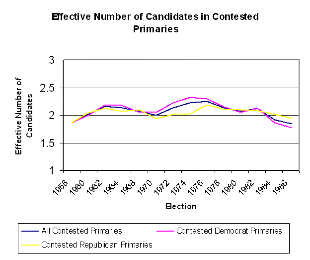
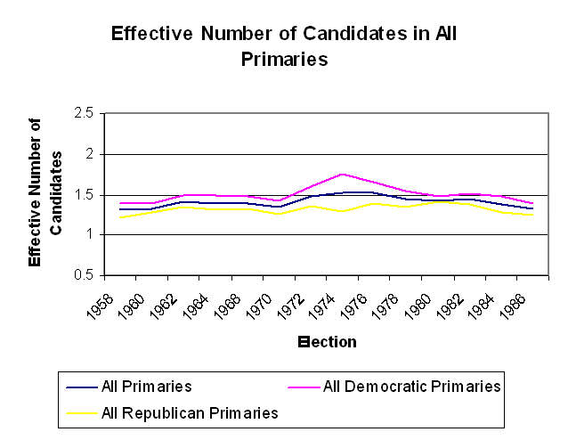
Effective Number of Candidates -- Contested House Primaries
The problem with using the number of contested primaries as a measure is
that there are a lot of nuts who run and get 5% of the vote. A better
measure of competition is the Effective Number of Candidates.
This measure weights serious candidates more heavily than the turkeys. This
measure is simply the inverse of the Herfindahl of vote shares:
        ENC = 1/S(vi)2

        0 < vi < 1 = Vote Share of Candidate i
Note that if vi = 1, ENC = 1, if vi = 1/N,
ENC = N. Hence, if there are two candidates in the primary and both
get 50%, ENC = 2.
The two graphs below show the effective number of candidates in
contested primaries and all primaries respectively. There is no
evidence that primaries are more (or less) competitive over this
time period.
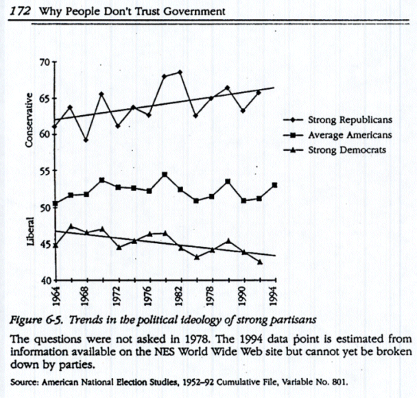
- What about the Mass Public?
Is the mass public polarized? That is, has there been a trend
since the 1960s to polarization in public opinion? There is some scattered
evidence for mass public polarization but it is not very dramatic.
DiMaggio, Paul, John Evans, and Bethany Bryson (1996). "Have Americans'
Social Attitudes Become More Polarized?" American Journal of Sociology,
102 (Nov. 1996): 690-755. After looking at a wide range of issues in
NES and GSS studies, they found that only party identifiers showed an increasing
trend in attitude divergence on some issues.
Using NES data, David King ("Party Competition, Primaries, and
Representation in the U.S. Congress." Paper prepared for the MIT Conference on
Parties and Congress, 2 October 1999) found that strong party identifiers had increasingly
divergent thermometer scores for liberals and conservatives over time.
Using NES data, Larry Bartels ("Partisanship and Voting Behavior."
American Journal of Political Science, 44:35-50, Jan. 2000) shows that
partisanship is increasingly affecting the behavior of those people who
show up at the polls and vote.
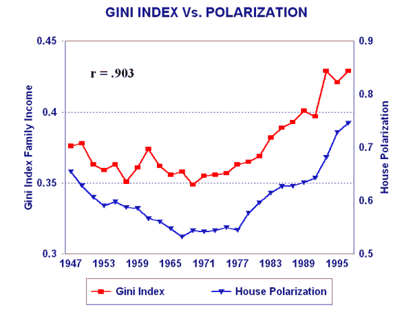
- Income and Wealth Inequality?
(The gini data are from the U.S. Census.)
Argument -- This makes sense. The basic difference between the
two political parties is their differing views on the role of government
in the economy. We do not have a well articulated theory but it
fundamentally makes sense that as the income/wealth distribution in
society begins to skew that this would show itself eventually in
the political system in that it would draw more people into the
political arena that on the one hand would want to defend the
status quo and on the other hand would want to reform the system.
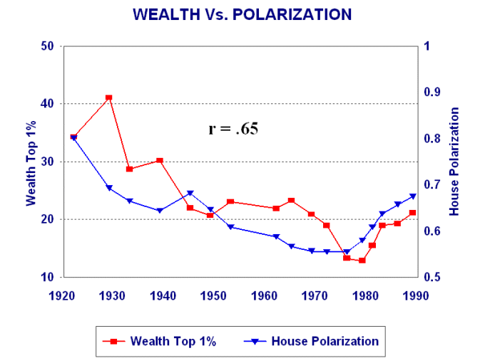
Wealth vs. Polarization -- r = .65. The Wealth data
are from:
Wolff, Edward N. (1996). Top Heavy: The Increasing Inequality of
Wealth in America and What Can be Done About It. New York: The
New Press.
This is
noisy but it still makes sense. The
Political System was the most polarized in the 1890s and very
early 20th Century just when wealth inequality was the highest.
It then fell after the income tax and esp. WWI. Note that correlation
is lowered by the upward spike in wealth due to the run-up in the
stock market in the late 1920s.
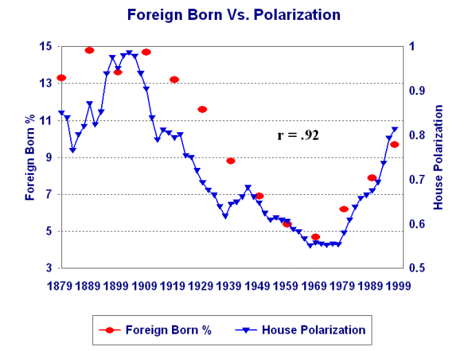
Foreign Born vs. Polarization -- r = .92. The percent
foreign born are from the U.S. Census. The basic idea is that
immigrants tend to come in at the lower end of the income/wealth
distribution. Hence, the more foreign born there are, the more
inequality of income/wealth.